Are you looking to create the most effective LinkedIn Ads?
LinkedIn is a very different social network from Facebook – so you should NOT re-use the same exact ad copy…
(It does not work the same!)
LinkedIn is a professional social network. Members are older on average, they’re in a “business mindset”, and they’re using LinkedIn for very different reasons from when they use Facebook.
To be successful with LinkedIn ads, you must communicate differently with it’s professional audience.
Plus, LinkedIn’s bidding is different. We are usually paying on a cost-per-click (CPC) basis, NOT a CPM basis (which Facebook usually is).
LinkedIn’s algorithms do not “learn” in the same way that Facebook’s algorithms do. Therefore, we rely very little on the platform to optimize our campaigns for us.
So, we must intentionally create our ads – our ad copy and our creative – specifically for the LinkedIn platform.
Simply re-using the same Facebook ads on LinkedIn will get you poor results. Here are some tips to help you create the best LinkedIn ads!
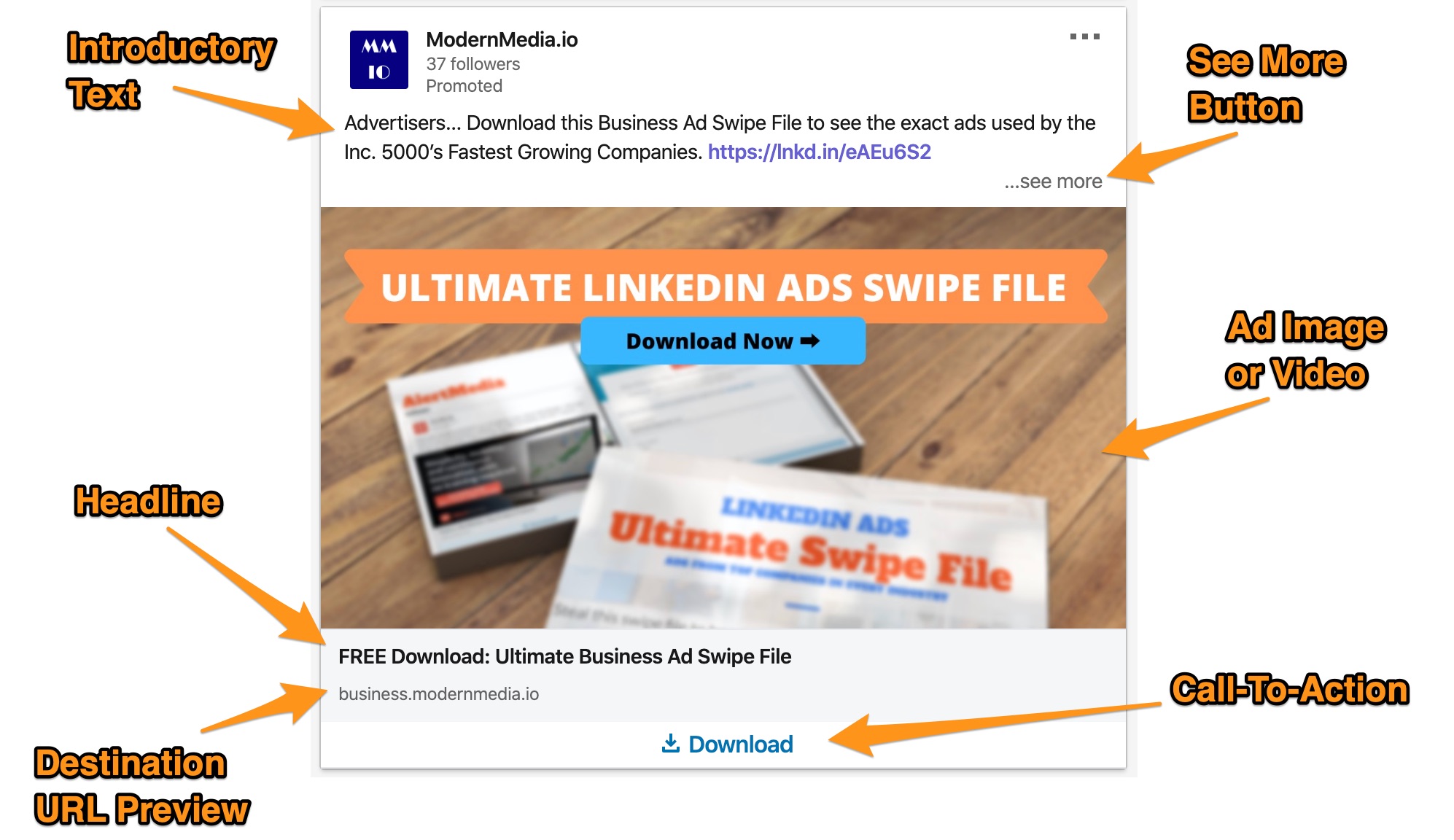
LinkedIn Ad Components
First, here are the elements of a LinkedIn sponsored content ad unit.
You’ll have to define all of these inputs to create your ad. We’ll refer to these and explain best practices for each below!
LinkedIn Ad Copywriting Tips
1. Be very clear what the offer is and who it’s for.
On LinkedIn, you’re usually paying on a cost-per-click (CPC) basis. That means you pay when someone clicks on your ad. But, you DO NOT pay when someone sees your ad but does not click.
Therefore we do not want to draw unqualified clicks – that only wastes money.
Alternatively, on Facebook you’re usually paying on a CPM (cost per impression) basis. On Facebook you pay whether someone clicks or not, so you want to draw in the most people.
Advertisers often use curiosity to draw in a prospect. Again, that works on Facebook. On LinkedIn, you’ll often end up spending a lot of more money.
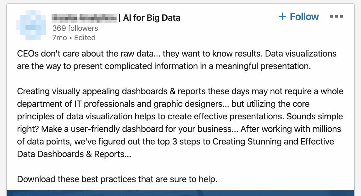
2. Put the CTA above the fold.
LinkedIn sponsored content can use up to 600 characters.
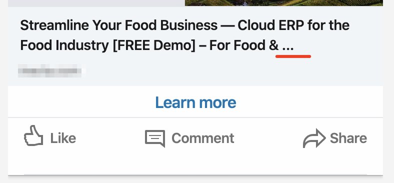
After 150 characters (the “intro” or the “fold”), your copy is hidden and there is a ‘…see more’ button.
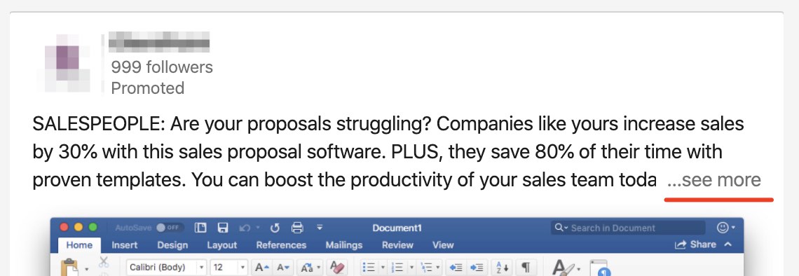
After 150 characters the ‘…see more’ will truncate your ad copy
We find that short and direct ad copy works best on LinkedIn.
Keep in mind that most people will not click ‘see more’, so your intro ad copy should be able to stand alone without that remaining text.
For top-of-funnel and middle-of-funnel ad copy (TOF and MOF – colder audiences), using longer ad copy can be useful.
But we also recommend putting the call-to-action above the fold (before 150 characters – where the ‘see more’ button appears on longer ad copy).
You are NOT charged for a click on the ‘…see more’ button.
GOOD:
Your above the fold ad copy must be effective on it’s own (most people do not click see more).
3. Use bullet-points in the ad copy.
When someone does click on the ‘…see more’ button, use some eye-grabbing bullet points to draw them further down your ad.
Hitting them with a wall of text is difficult to read and digest. They’ll be likely to just scroll away.
Bullet points, especially with emojis are good for this.
BAD:
⚠️ No one wants to read a wall of text, and most people won’t bother.
GOOD:
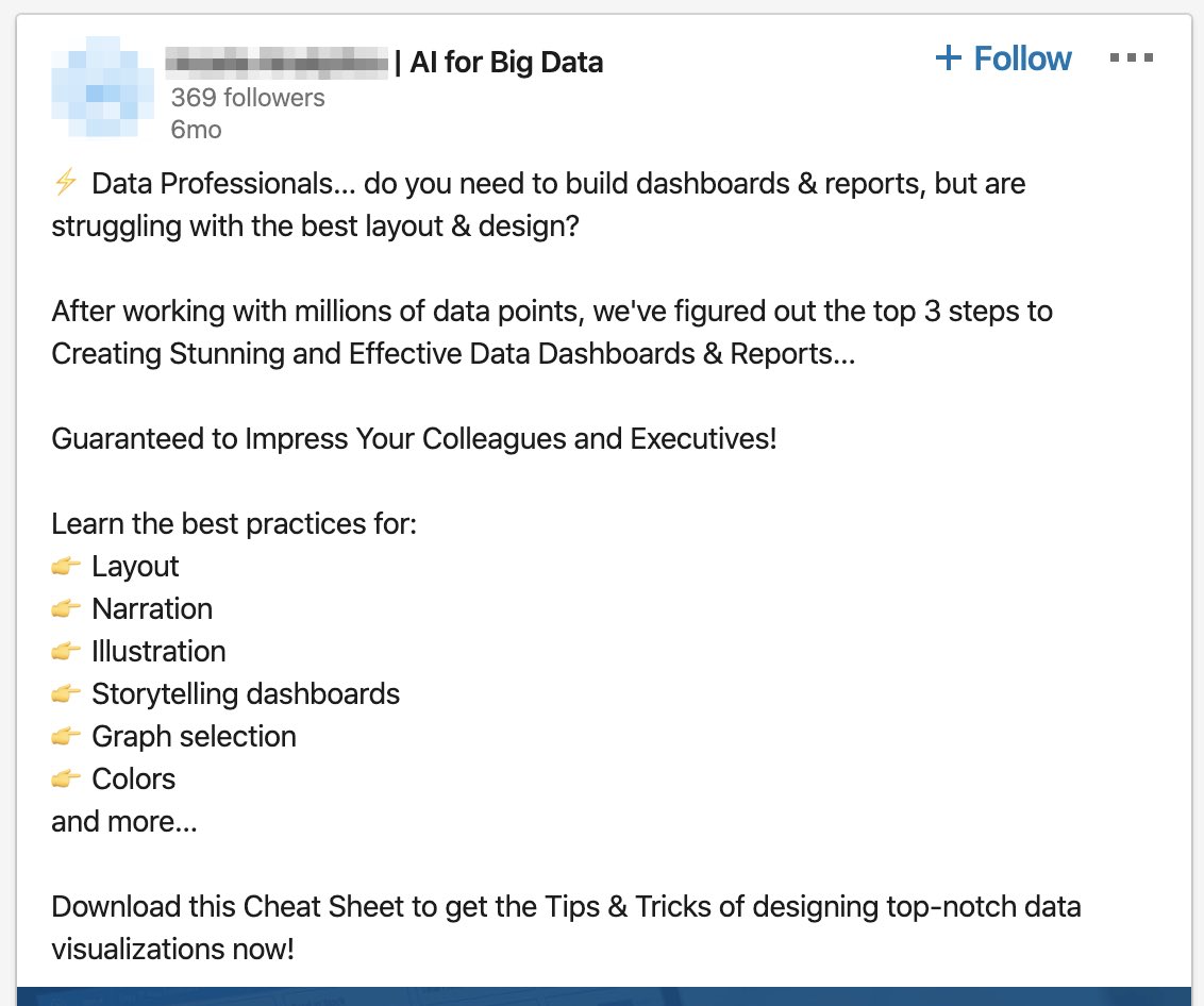
Bullet points and spacing help draw the viewers eye through the ad and improve comprehension.
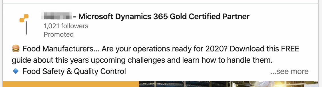
4. Call out your audience.
More on #1, call out your audience in the first sentence or in the headline of your ad.
So it’s very clear exactly who your offer is for, and why they should care. Again, you want to reduce the number of unqualified clicks.
Remember, people care about what’s in it for them – not about your features.
GOOD:
Clearly call out your audience
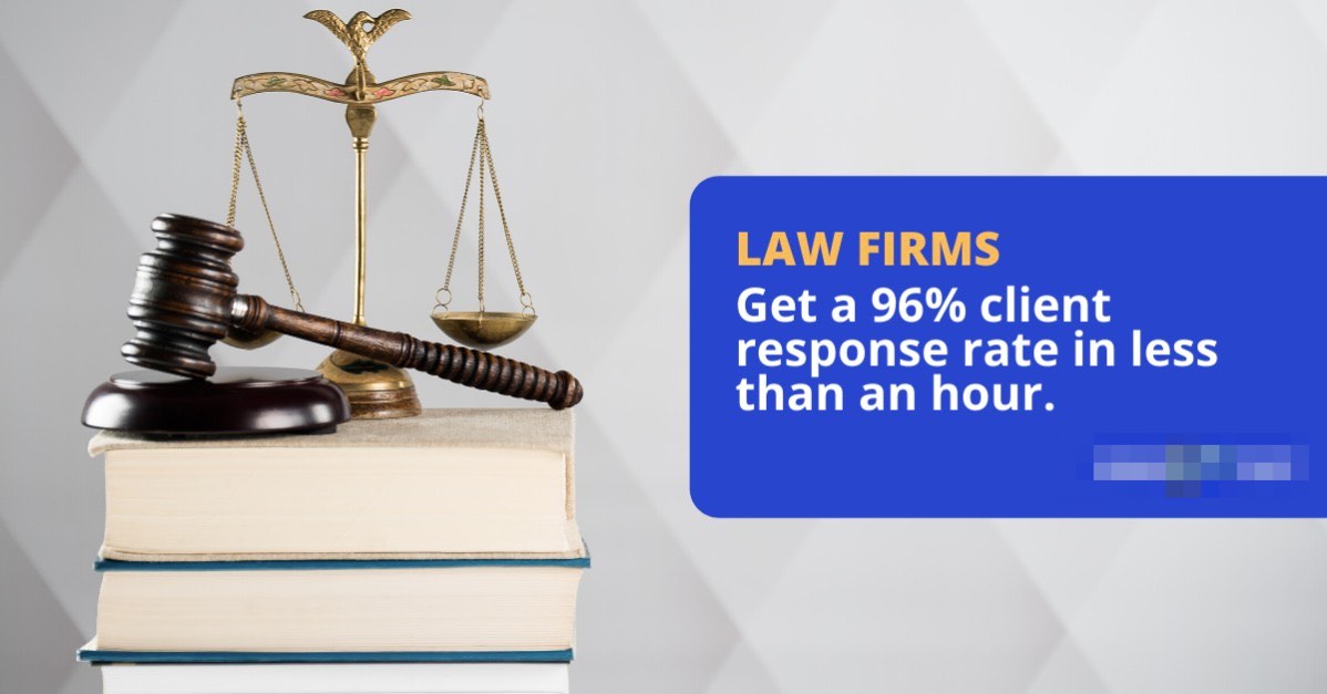
5. Start with an Emoji.
Use emoji’s sparingly and tastefully in your LinkedIn ads.
But they are a good way to draw your reader’s eye into your ad to start reading. Ads that start with emojis almost always have a higher CTR.
(Be clear on your audience and offer so that higher CTR doesn’t waste your money – see earlier tips)
We find the Zap ⚡️ or an emoji with a color that stands out from the LinkedIn background AND from your ad image colors are good.
GOOD: (See #5’s image above)
6. Use the right CTA button.
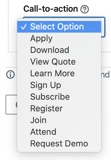
The available options for Lead Generation call-to-action buttons are:
* Sign up, Apply Now, Download, Get Quote, Learn More, Subscribe, Register
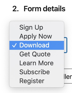
Lead generation call-to-action button options
The choices for Website Conversions call-to-action buttons are:
* Apply, Download, View Quote, Learn More, Sign Up, Subscribe, Register, Join, Attend, Request Demo
Website conversions call-to-action button options
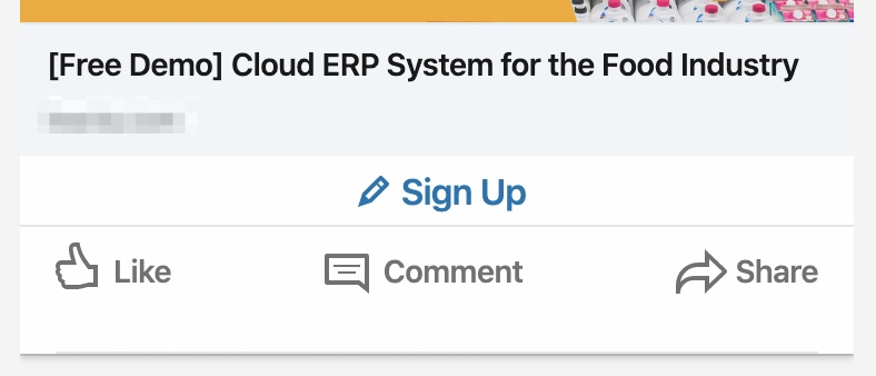
For Request a Consultation or Request a Call ads, we usually use “Sign Up”.
7. Keep headlines short (under about 70 characters)
When your headline gets cut off, there’s no way for the viewer to see the rest of it (whereas with ad body copy, they can hit ‘see more’).
So for clarity’s sake, use short headlines.
Spacers and brackets are good for enhancing readability.
BAD:
Don’t let your headline get cut off
GOOD:
Short and direct headlines work best
8. Limit use of uppercase/caps and emojis.
Overusing emojis and caps (like many Facebook ads do) will cause your ads to be disapproved.
For example, headlines in all caps or using more than one emoji in a row usually triggers an automatic disapproval.
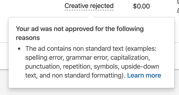
Too many emojis or uppercase letter will automatically trigger LinkedIn’s rejection
9. Use a professional tone and avoid slang.
People are in a business mindset when they’re on LinkedIn, and most people take their work quite seriously.
Therefore, your ad copy should convey the same level of professionalism, or else you risk losing credibility.
If you’re running Facebook ads, keep in mind that your FB ad copy is likely too conversational, and too relaxed.
10. More copywriting tips!
- Be specific (numbers help stick out from the text).
- “Find out how we made $765,997 in two months by…”
- “See how we increased leads by 356%…”
- Start with a ‘Yes’ question.
- “Are you looking for the best ad copy tips?”
- “Is your conversion rate below 3%?”
- Use FOMO or create a sense of urgency.
- “Download this guide now before you forget”
- Align the copy and headlines in your ads and landing pages.
Need help with your LinkedIn Ads?
Book a call today >>
LinkedIn Ad Design Tips
11. Use the right dimensions
- Sponsored Content
- Single Image: 1200×627 to 1200×1200 (recommended) to 1200×2292
- Carousel Image: 1080×1080
- Video: 1280×720 or 1080×1080
- Sponsored InMail: 300 x 250
- Text ads: 100×100
For single image ads, if the image is taller than square format, it will only display on mobile (and not desktop).
Square format is recommended because it takes up the most screen real estate and displays on both mobile and desktop.
See LinkedIn Ad Specs & Guidelines.
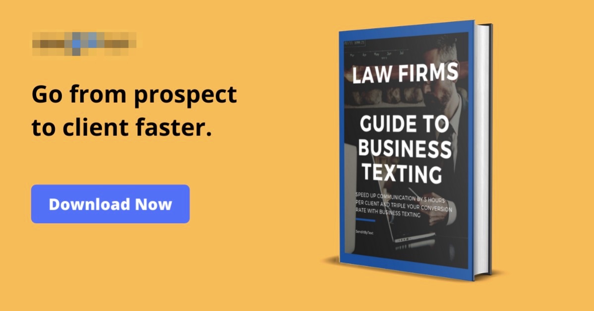
12. Choose an image that will grab your audience’s attention.
People are scrolling through LinkedIn just as fast. Use an image that will grab their attention.
Images of their industry or job do well. Ask what is a visual that is already top of mind for them?
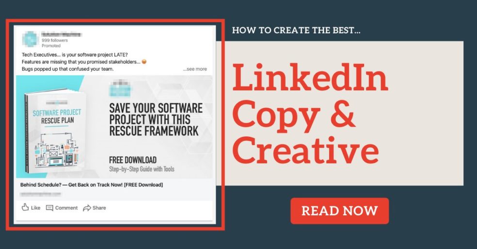
For lead magnets, an image of the downloadable is good (see #13’s image).
Avoid pattern-interrupt images – until you have specific targeting and a proven audience, then they are worth testing.
What’s an image that’s already top of mind for your prospect? THAT will grab their attention.
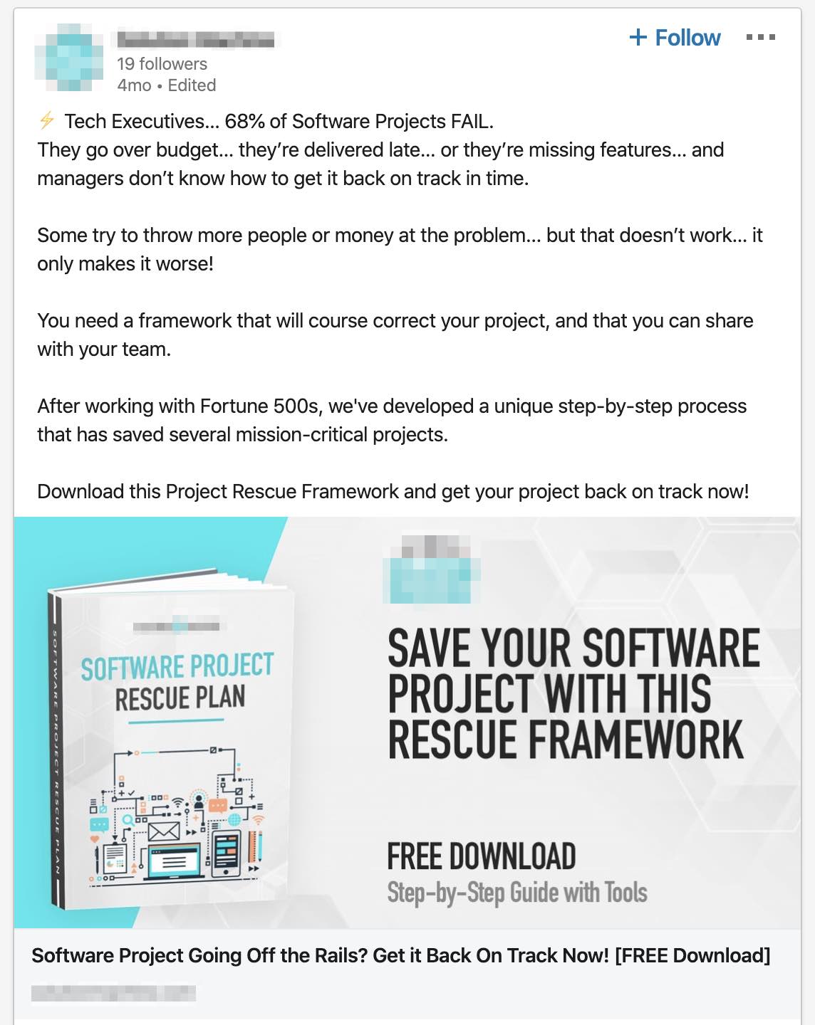
13. Use colors that stand out.
The LinkedIn interface is darker – mostly blue and gray.
Therefore, you want to choose colors that stick out from this backdrop. Oranges, reds, and greens are good.
GOOD:
Use colors that contrast from the LinkedIn interface
14. Add a Button.
Graphical buttons generally boost performance. Be sure the button’s text is aligned with your ad’s call-to-action. See #13’s image.
15. Overlay text that supports your offer.
LinkedIn does not have a 20% text rule that Facebook does. So you can include much more text in the ads.
Adding a headline and sometimes subheadline in the image helps. Be short and to the point. See #16’s images.
16. Find examples and inspiration of good ads.
Software company LinkedIn ad example
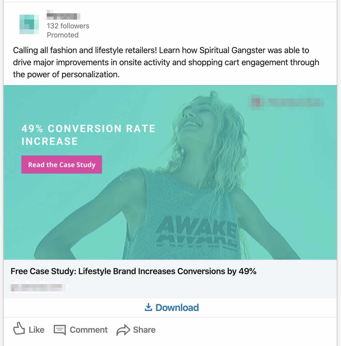
Case study LinkedIn ad example
For more inspiration, learn how you can see what ads other companies are running here.
Need help with your LinkedIn Ads?
Book a call today >>